

Music - 1 day 6 hours ago
Dynamite's Seduction of the Innocent has an awesome title, but does it live up to it?
FTC Statement: Reviewers are frequently provided by the publisher/production company with a copy of the material being reviewed.The opinions published are solely those of the respective reviewers and may not reflect the opinions of CriticalBlast.com or its management.
As an Amazon Associate, we earn from qualifying purchases. (This is a legal requirement, as apparently some sites advertise for Amazon for free. Yes, that's sarcasm.)
Submitted by Mike 'Ace' Maillaro on Fri, 12/04/2015 - 07:19
I absolutely love that Dynamite snatched up the name SEDUCTION OF THE INNOCENT. Dynamite has been making a lot of cool moves over the last few years, bringing in big name talent and letting them loose on a variety of genres. The name SEDUCTION OF THE INNOCENT has a reputation in the comic industry because of how much damage Dr. Fredric Wertham's book did to the industry back in the 1950's. SEDUCATION OF THE INNOCENT basically casted the vast comic industry to shrink down to "superhero" and niche books. Companies like IDW, Dynamite, Dark Horse, and Image have been making huge strides in expanding the industry again. I can't but see Dynamite repurposing the title SEDUCATION OF THE INNOCENT as the perfect example of "taking it back."
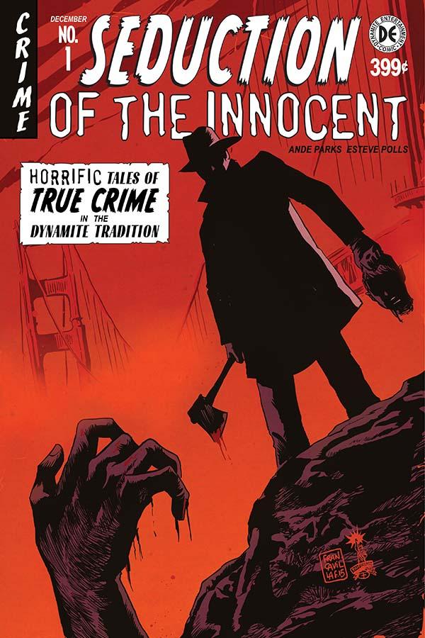
SEDUCTION OF THE INNOCENT #1
Written by: Ande Parks
Art by: Esteve Polls
Colored by: Salvatore Aliala Studios
Lettered by: Simon Bowland
Cover by: Fransesco Francavilla
Published by: Dynamite
Cover Price: $3.99
Warning! This review contains quite a few spoilers!
SEDUCTION OF THE INNOCRENT is about a young FBI agent from Cleveland who moves to San Francisco and is partnered with a grizzled veteran. They have been called in on a missing person’s case. Over the last two weeks, six mob bosses have gone missing. But this is the first time any clues have been left behind when they find a dry blood stain at the crime scene. More mob bosses start to go missing, and in the end, we find out that this is all tied to a Nazi group looking to spread chaos.
What jumped out at me immediately when I started reading this book was how it lays the setting out so perfectly right on the first page. YA Tittle is the new quarterback in town and newspapers costs 20 cents. Even before the book tells you, you immediately know that you are in 1950's San Francisco. I loved these subtle cues. They did this throughout the book, giving you a real clear sense of where you were, who the characters were, and why the reader should care.
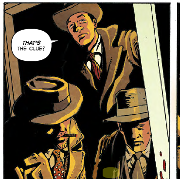
In a lot of ways, this was a very by-the-books crime comic. You get a fresh-faced rookie partnered with a jaded veteran. They catch a huge case with major mob and political ties. It wasn't all that complicated a story, but it was still pretty well done. Maybe it could have used a few more twists and curveballs, but it's still the core of a solid first issue here. You get a lot of intrigue and action, and I thought the setting was really well laid out. I also loved the twist in the end where you see the assassins sitting under a picture of Hitler. It was just a huge impact on the reader and really caught my attention.
But I think the major problem here is that it might be a little too "by-the-books." I read this comic, and I enjoyed it. But by the time I read the next comic in my stack, I had pretty much forgotten about SEDUCTION OF THE INNOCENT entirely. There just wasn't anything "big" about this book to real stick with the reader, other than the poster of Adolph Hitler. I've said this in numerous reviews. The comic industry is pretty stacked with top quality books. If a new title wants to make an impression, it needs to do something to grab the reader quick or they will move on to the next option.
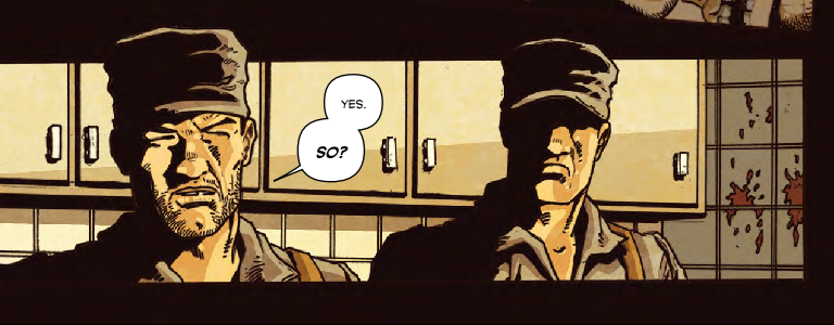
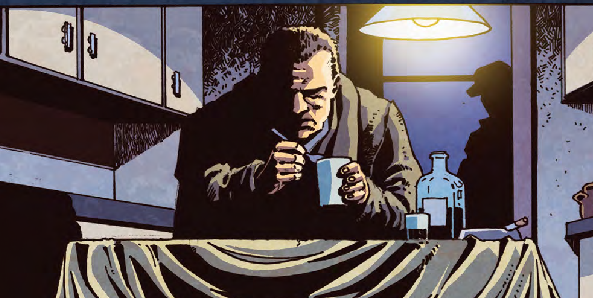
One major concern for me was the art. I get that the characters were supposed to be non-descript, but it made the story a bit hard to follow at times. Giving each character a little more unique visual qualities would have gone a long way towards making this a great comic. It stands out even more because I think in terms of characterization and dialogue, each character was well fleshed out. There were plenty of subtle little dialogue ticks that made each character feel unique. But, when you tack on the generic art, it made the story a bit jarring at times. Especially since the comic had a lot of silent panels to help set the mood, and that is when they kept losing me. Is that a cop about to be murdered? No. It's a mobster. Is that a cop who killed him? No. Nazis with a mysterious agenda. But when you see how generic they are all drawn, you can understand my confusion.
I was definitely hoping for a little more here. It was not a bad comic, but it didn't feel like it had much new to offer the reader, other than the eye-catching title. These days, there are quite a few crime books, and all of them stand out a lot more than this one did. It was solid execution, but limited excitement. I actually think this could have been far better if they embraced the over-the-top sexuality and violence of horror and crime comics of the era. Instead, it almost feels like they put the title on this book just because they knew it was a bit generic and wouldn't grab much attention. As a sales gimmick, it is a great way to get readers to buy the first issue, but I am not sure I will be coming back for more.
If reading this book inspires you to check out some more modern crime comics, I would suggest CRIMINAL, FATALE, THE TITHE, SPIRIT, GREEN HORNET, SHAFT, even POWERS. All of them have a lot more to offer than SEDUCTION OF THE INNOCENT, I am sorry to say. I had high hopes for this one, so I am definitely disappointed.
| Title: | Seducation of the Innocent #1 |
| Written By: | Ande Parks |
| Art By: | Esteve Pools |
| Company: | Dynamite |
| Price: | $3.99 |
| Pros: |
|
| Cons: |
|
| Is it worth your $3.99? | Probably not. It's not a bad book, but there are plenty of better options if you are looking for something outside the box. |
Grade:
3.5 / 5.0